Tableau is a powerful data visualization tool that empowers professionals across different industries to analyze data independently. Compared to traditional Excel spreadsheets, it’s more like an enhanced version of Excel. Many businesses require the transforming of complex data into intuitive and understandable charts and graphs to aid those less adept at data analysis in comprehending the data.
The simplicity and ease of use of Tableau allows users to enjoy a user-friendly experience, even without a technical background. Through simple mouse clicks and drag-and-drop operations, users can quickly organize and analyze data, creating beautiful visualizations without the need for cumbersome programming or complex data processing steps.
This article introduces the basics of Tableau, providing a brief guide to help readers quickly understand how to use this powerful tool for data analysis and visualization.
Navigating the Tableau Interface
Let’s start with the Tableau homepage, which is divided into three main sections: Connect, Open, and Discover.

In the Connect section, you can connect to various types of files, such as Excel files, PDFs, spatial files, text files, JSON files, and more. Additionally, you can connect to different servers to access and analyze data.
Next, when you click on the file you want to open, Tableau creates a workbook containing different sheets of data. You can choose to continue adding new files or start analyzing directly.
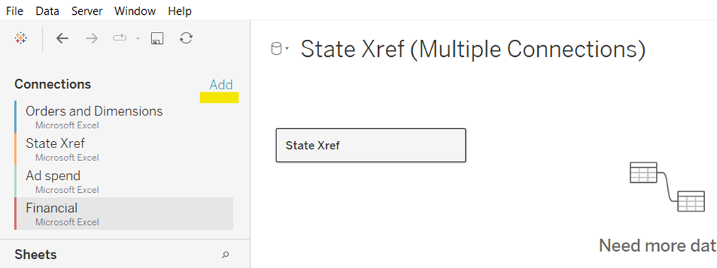
By dragging and dropping sheets from different files into the workspace, you can use related fields to connect the data between different files.

However, not all files can be directly appended together. If there are no matching fields, it may result in unsuccessful connections. This point needs to be carefully considered to avoid data connection issues.

Analyzing Data in Tableau
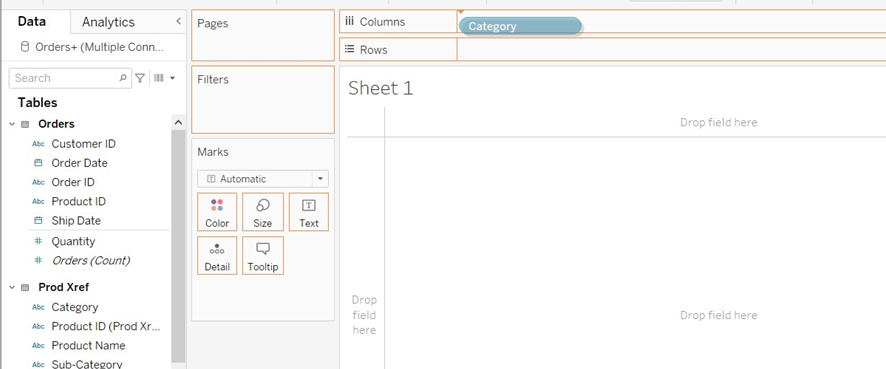
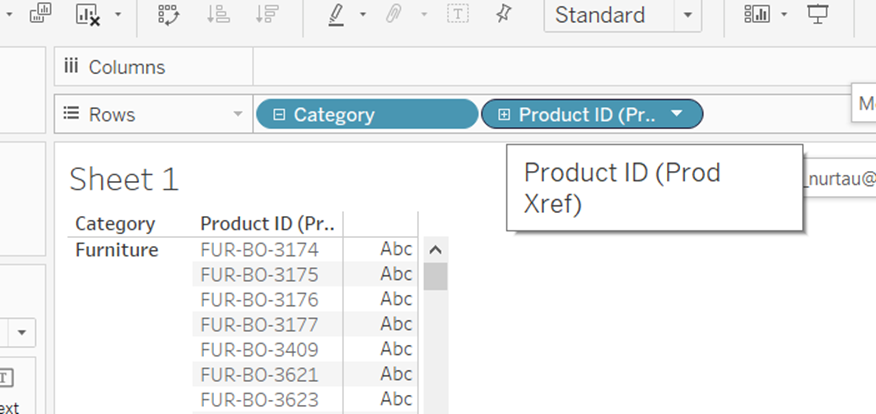
Once you’ve successfully linked the files, you can click on Sheet 1 at the bottom left to start analyzing your data. In the Tables area on the left, you’ll see the fields from your Excel spreadsheet. Just like using pivot tables in Excel, you can drag the fields you need into any desired position in the sheet—either in rows or columns—to display charts. You can also place multiple fields simultaneously to create complex charts.
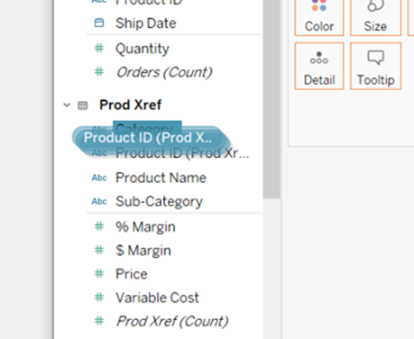
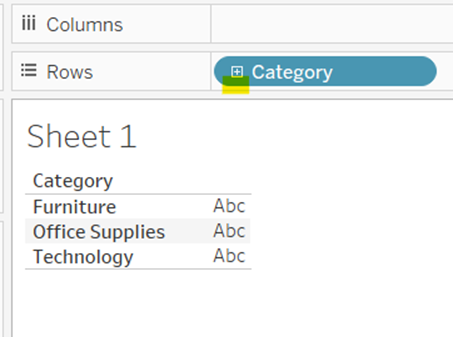
Furthermore, you can choose to drag one field onto another to create a hierarchy. Hierarchies group fields together, and you can expand another field by clicking the plus sign in the hierarchy. When not needed, you can collapse it by clicking the minus sign. Through these simple and intuitive operations, you can quickly create the charts and graphs you need.
Enhancing Visualizations with Tableau
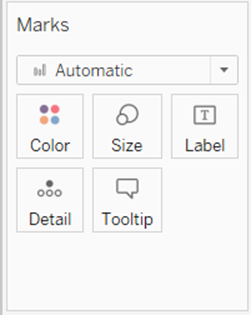
With your first chart generated by dragging different fields into the “Marks” area, you can easily adjust the appearance of the chart. You can change the color of the fields, add labels, and more to make the chart more readable and attractive.
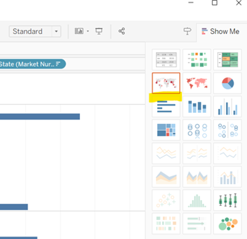
If you want to try different types of charts, simply click on “Show Me” in the top right corner, and Tableau will provide you with various available graph options. It’s worth noting the graphs circled in orange; these are Tableau’s intelligent display features, which automatically recommend the most suitable chart types based on your data, helping you quickly discover trends and patterns. This intelligent display feature allows you to quickly create meaningful visualizations without spending time researching different types of charts.
In Tableau, exploring data and creating engaging visualizations has never been easier. With its intuitive drag-and-drop interface and intelligent display features, you can easily transform data into insights and share your discoveries with others.


Love it